Simple Website Design: The Key to Better Conversion and User Experience

In an era of increasingly complex digital landscapes, web designers and marketers are rediscovering a fundamental truth: simplicity sells. Recent studies and expert opinions suggest that adopting a minimalist approach to website design can significantly boost conversion rates and enhance user experience.
The Power of Simplicity
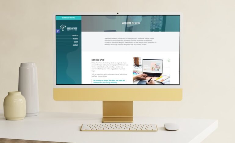
“In the digital world, less is often more,” says Michelle Coyle, owner of Beechtree Marketing in New Jersey. A clean, uncluttered website design not only looks more professional but also effortlessly guides visitors towards your call to action, ultimately improving conversion rates.”
Digital marketing expert Neil Patel echoes this sentiment, warning against the common pitfall of information overload. “Far too often, I see websites try to jam too much information into a very small space,” Patel notes. The navigation becomes confusing, and it’s overwhelming for anyone viewing the site.”
Alex Brinkman, founder of Grow With Meerkat Digital Marketing in Toledo, Ohio, adds another perspective: “Simple website design isn’t just about aesthetics—it’s about psychology. When users can easily navigate and understand your site, they’re more likely to trust your brand and take desired actions. In our experience, simplifying a client’s website can lead to conversion rate increases of up to 200%.”Users who can easily navigate and understand your site are
Key Benefits of Simple Website Design
- Improved Conversion Rates: Simple designs focus user attention on key elements, making it easier for visitors to complete desired actions.
- Faster Loading Times: Streamlined designs typically require less bandwidth, resulting in quicker page loads – a critical factor in user retention and search engine rankings.
- Mobile-Friendly: With over 60% of web traffic now occurring on mobile devices, simple designs are more adaptable to smaller screens.
- Cost-Effective: Less complex websites often require less storage and bandwidth, potentially reducing hosting costs.
- Reduced User Friction: Intuitive, straightforward designs create a smoother user experience, decreasing bounce rates and increasing engagement.
Strategies for Simplifying Your Website
- Limit Navigation Options: Evernote’s homepage, for example, features just three main menu items, guiding users efficiently through their site.
- Focus on Call-to-Action: DreamHost’s landing page demonstrates how design elements can be used to draw attention to the primary CTA button.
- Embrace White Space: Allowing for breathing room between elements can make your content more digestible and visually appealing.
- Optimize for Speed: Compress images, trim unnecessary copy, and minimize complex graphics to improve load times.
- Follow Industry Standards: Adhere to common design patterns within your industry to create a familiar and comfortable user experience.
As businesses compete for attention in the digital realm, the trend towards simplicity in web design is likely to continue. By focusing on essential elements and streamlining the user journey, companies can create more effective online presences that look good and drive results.
In an age of information overload, sometimes the most powerful message is also the easiest to understand.


