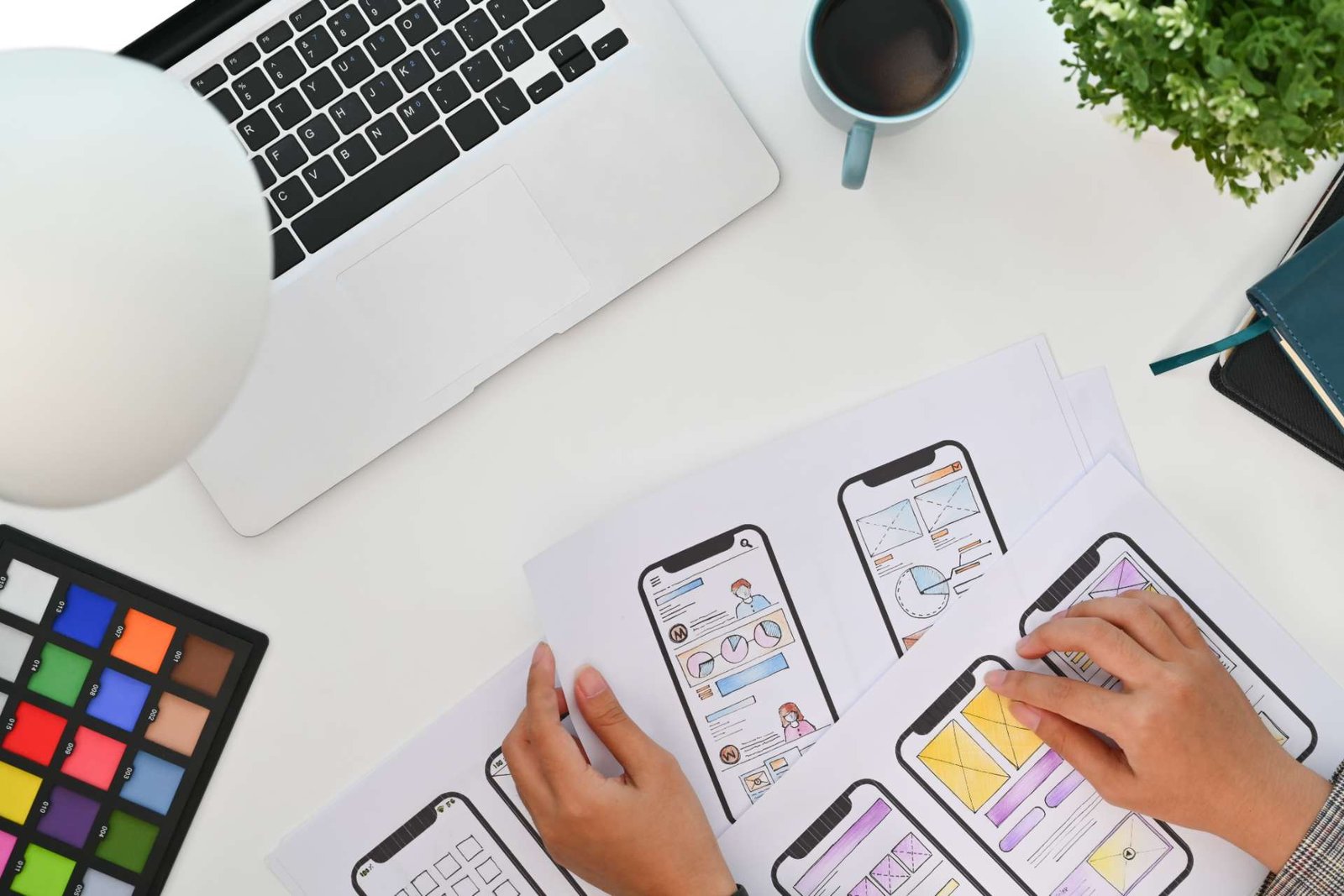
How to Enhance User Experience in Web Design
To enhance user experience in web design, start by prioritizing mobile responsiveness. According to a report by Statista, over half of global web traffic comes from mobile devices, so it’s crucial to ensure your site works well on all screens and that touch gestures are intuitive.
Simplifying navigation menus with clear and consistent labels can also make a big difference. Research from the Nielsen Norman Group shows that intuitive navigation significantly improves user satisfaction.
Optimizing page load times is another key factor. Google has found that 53% of mobile users abandon sites that take longer than three seconds to load. You can speed up your site by compressing images and leveraging caching.
When it comes to call-to-actions (CTAs), make them engaging and strategic. Avoid generic terms and use language that motivates users to act. According to a study by HubSpot, personalized CTAs perform 202% better than basic ones.
Accessibility is equally important. Implement features like high color contrast and keyboard navigation to ensure everyone can use your site. The Web Content Accessibility Guidelines (WCAG) recommend these practices to make the web more inclusive.
Use bold colors and large fonts to create a clear visual hierarchy and improve readability. Consistent branding and effective use of white space can also help balance your design. Studies, including those published in the Journal of Usability Studies, show that these elements contribute to a more enjoyable and user-friendly experience.
By focusing on these details, you’ll create a web design that not only looks good but also functions well for all users. There’s always more to explore, but these basics will set you on the right path.
Key Takeaways
- Make sure your site is mobile responsive and that touch gestures work smoothly on all devices. This ensures users have a seamless experience whether they’re on a phone, tablet, or desktop.
- Keep navigation menus simple with clear labels and consistent dropdown organization. This makes it easier for users to find what they’re looking for quickly.
- Speed up page load times by compressing images, using browser caching, and ensuring efficient server use. Studies show that faster load times improve user satisfaction and reduce bounce rates.
- Design compelling call-to-action buttons using engaging language and placing them strategically to boost user interaction. A well-placed CTA can significantly increase conversion rates.
- Incorporate accessible design practices such as high contrast, keyboard navigation, and alternative text. This makes your site usable for everyone, including people with disabilities and is increasingly becoming a legal requirement in many regions.
Prioritize Mobile Responsiveness
In today’s fast-paced digital world, ensuring your website is mobile-responsive is crucial for providing a seamless user experience. Think about how users interact with their devices—primarily through touch gestures.
By prioritizing mobile responsiveness, you make it easier for visitors to navigate your site using taps, swipes, and pinches, greatly enhancing their overall experience.
One critical aspect to consider is viewport scaling. When your website’s elements automatically adjust to fit different screen sizes, users won’t have to struggle with zooming in and out. This automatic adjustment makes your content more accessible and engaging, keeping users on your site longer.
As you design, keep in mind the various devices your audience might use. Test your website across different screen sizes and orientations to ensure consistency.
Don’t overlook small details like button sizes and spacing; they can make a significant difference in usability. Prioritizing these elements demonstrates your commitment to innovation and user satisfaction, ultimately setting you apart in a crowded digital landscape.
Simplify Navigation Menus
Just like mobile responsiveness boosts usability, making your navigation menus simpler ensures users can easily find what they’re looking for. When you streamline your navigation, you make it easier for visitors to engage with your content. Start by using intuitive labels that clearly describe each section. Users shouldn’t have to guess what ‘Services’ or ‘Contact’ means; it should be immediately obvious.
Think about adding dropdown menus to keep your navigation clean and organized. These menus let you include more links without overwhelming users. But make sure these dropdowns are easy to use—avoid making users perform complex actions to reveal sub-menus. A simple hover or click should do the trick.
Consistency is crucial. Use the same navigation structure across all pages so users always know where to find what they need. Keep the most important links at the top level, and avoid hiding critical information several layers deep.
Lastly, test your navigation on various devices to make sure it’s just as intuitive on a smartphone as it’s on a desktop. By focusing on simplicity and clarity in your navigation menus, you provide a seamless and pleasant experience that encourages users to stay longer and explore more.
Optimize Page Load Times
Nobody likes waiting for a slow website to load, so optimizing page load times is crucial for keeping your users engaged and satisfied. Slow pages can frustrate users and drive them away, but you can take several steps to ensure your site performs efficiently.
First, focus on server efficiency. Choose a reliable hosting provider and consider using a Content Delivery Network (CDN) to distribute your content globally, reducing the distance data must travel. Efficient servers can greatly reduce load times, ensuring your users get a seamless experience.
Next, pay attention to image compression. High-resolution images are great for visual appeal but can significantly slow down your site if not optimized. Use tools like TinyPNG or ImageOptim to compress images without sacrificing quality. This simple step can make a noticeable improvement in load times.
Additionally, leverage browser caching. By storing parts of your site on users’ devices, you can reduce the amount of data that needs to be loaded on repeat visits. This not only enhances speed but also creates a smoother user experience.
Implementing these strategies demonstrates your commitment to innovation and user satisfaction. Keep refining your approach to guarantee your website remains fast and efficient.
Use Clear Call-to-Actions
A crucial call-to-action (CTA) helps guide your users toward the next step, making their journey through your site smooth and intuitive. Designing CTAs that are visually appealing and strategically placed can make a big difference.
For instance, positioning your buttons in areas where users naturally look and interact—like the top right of a page or at the end of content sections—ensures that your CTAs are easily found without interrupting the user’s flow.
Using actionable language in your CTAs can significantly boost engagement. Phrases like ‘Get Started,’ ‘Learn More,’ or ‘Download Now’ clearly indicate what action users should take and what to expect. The language should be clear, concise, and compelling to motivate users to act immediately.
It’s best to avoid generic terms like ‘Click Here,’ which don’t offer enough context or urgency.
Implement Accessible Design
Ensuring your website is accessible to everyone, including people with disabilities, is key to creating an inclusive and smooth user experience. Let’s start with color contrast. High contrast between text and background is essential for readability, especially for users with visual impairments. You can use tools like the Web Content Accessibility Guidelines (WCAG) to check contrast ratios and make necessary adjustments.
Next, let’s talk about keyboard operation. Many users depend on keyboards instead of mice to navigate websites. It’s crucial that all interactive elements, such as links, buttons, and forms, are easily accessible via keyboard. Implement clear focus indicators to help users track their current position on the page. To ensure everything works as intended, try using your site with just a keyboard and identify any issues.
Additionally, don’t forget alternative text for images. This allows screen readers to describe visual content to visually impaired users. Make sure your site’s structure is semantically correct by using appropriate HTML tags. This helps assistive technologies understand and interpret your content accurately.
Incorporate User Feedback
To truly enhance your web design, gather and incorporate user feedback. This approach helps you understand user needs and preferences, allowing you to create a site that resonates with your audience and provides a seamless experience. User feedback is invaluable as it offers direct insights into what works and what doesn’t. Establishing feedback loops guarantees continuous improvement and innovation.
Here are some effective ways to collect and use user feedback:
- User Surveys: Create short, targeted surveys to gather specific information about user experiences and preferences. According to a study by SurveyMonkey, well-crafted surveys can yield high-quality data that informs design decisions effectively.
- Usability Testing: Conduct usability tests with real users to observe how they interact with your site. Research from the Nielsen Norman Group shows that usability testing is one of the most effective methods for identifying pain points and areas for enhancement.
- Feedback Forms: Integrate feedback forms throughout your site to capture spontaneous user comments and suggestions. Making it easy for users to share their thoughts increases the likelihood of receiving actionable feedback, as noted by a report from UserTesting.
- Analytics Tools: Use analytics tools to track user behavior and identify trends. According to Google Analytics, combining quantitative data from these tools with qualitative feedback delivers a comprehensive understanding of user interactions, helping to fine-tune your design.
Enhance Visual Hierarchy
Why is visual hierarchy so crucial in web design?
It guides your users’ eyes to the most important elements first, guaranteeing they navigate your site effortlessly. Imagine landing on a page where nothing stands out; confusion reigns. But with a well-crafted visual hierarchy, you create order and focus.
Start by using color contrast to highlight key areas.
A bold, contrasting color for call-to-action buttons makes them pop, drawing immediate attention. Research shows that color contrast can significantly improve user experience by making important elements more noticeable (source: Nielsen Norman Group). Think about how color can guide users through your site seamlessly, creating an intuitive journey.
Next, consider font size.
Larger fonts naturally draw the eye, so use them for headings and critical information. Studies reveal that larger fonts enhance readability and help users quickly identify key information (source: usability.gov). Pair this with smaller, readable fonts for body text to maintain balance. This not only enhances readability but also ensures users quickly grasp the hierarchy of information.
Remember, it’s not just about making things look pretty. You’re designing an experience.
Pay attention to spacing, alignment, and the overall flow. Research in web usability suggests that well-organized spacing and alignment improve user comprehension and retention (source: Smashing Magazine). Innovate by experimenting with different layouts and visual cues. Test and iterate until you find what resonates most with your audience.
Ensure Consistent Branding
Just like a visual hierarchy helps users navigate your site, consistent branding ensures they instantly recognize and connect with your brand. When elements like color schemes and logo placement are uniform across your website, it creates a cohesive experience that builds trust and loyalty.
Consistency isn’t just about aesthetics; it’s about making your users feel at home every time they visit.
Here’s how you can maintain consistent branding:
- Color schemes: Stick to a defined palette that reflects your brand’s personality. Using these colors consistently across all pages creates visual harmony.
- Logo placement: Always position your logo where users expect it, typically in the top-left corner. This reinforces brand identity and aids navigation.
- Typography: Use a consistent set of fonts and styles. This not only enhances readability but also strengthens brand recognition.
- Imagery and Icons: Choose images and icons that align with your brand’s aesthetic and message. Consistency here can significantly impact user engagement.
Utilize White Space Effectively
Using white space effectively can significantly improve your website’s user experience by making it easier to read and navigate. According to research on web usability, white space creates a visual balance that draws attention to key elements without overwhelming visitors. This not only highlights important content but also enables users to digest information comfortably.
By reducing clutter, you give your website a clean, modern look that appeals to those who value simplicity and elegance. White space isn’t just about blank areas; it includes margins, paddings, and the spaces between lines of text and images. These elements guide the user’s eye naturally across the page, enhancing their overall experience.
Think of white space as the breathing room your content needs. Overloading your pages with information can make users feel overwhelmed and frustrated. Instead, strategically place white space around important features to create a sense of openness and clarity. This improves readability and makes your design more engaging and user-friendly.
Incorporating white space effectively helps you achieve a harmonious design that resonates with your audience, making your website enjoyable to explore. Embrace this powerful tool to create an innovative, user-centric web experience.
Focus on Readable Typography
To make your content more user-friendly, focus on readable typography that ensures easy access and comprehension. People love innovation, and clear, readable text can significantly enhance their experience. Start by selecting font pairings that not only look good together but also fit well with your overall design. Well-chosen fonts can create visual harmony and guide users seamlessly through your content.
How you align your text is also vital for readability. Left-aligned text is usually easier to read, especially for longer sections, because it offers a consistent starting point for each line. This reduces eye strain and boosts overall understanding.
Here are some tips to optimize your typography:
- Font Size: Make sure the font size is large enough to be comfortably read on different devices. According to research, a font size of at least 16px is recommended for body text on web pages.
- Line Height: Adequate line height (or leading) is crucial. Studies suggest that a line height of 1.5 times the font size can make text easier to read by preventing lines from appearing too cramped.
- Contrast: High contrast between text and background is essential for readability. For example, black text on a white background is generally the easiest to read, according to accessibility guidelines.
- Whitespace: Don’t underestimate the power of whitespace. Sufficient space around text blocks can help avoid overwhelming your audience, providing a cleaner and more digestible layout.


